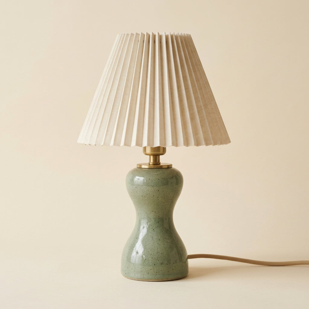
PLEAT — Ivory Pleated Table Lamp with a Sculptural Sage Green Base and Brass-Tone Accents
PLEAT — Ivory Pleated Table Lamp with a Sculptural Sage Green Base and Brass-Tone Accents
Couldn't load pickup availability

PLEAT — Ivory Pleated Table Lamp with a Sculptural Sage Green Base and Brass-Tone Accents
Texture First. Atmosphere Follows. 🌿
A room does not have to be filled with pattern to feel layered. Sometimes the difference lies in the rhythm of a lampshade, the curve of a base, and the space between two thoughtfully chosen objects. PLEAT brings those details together in a warm ivory shade, a softly sculpted sage green base, and a small brass-tone connection. The palette is gentle, but the design has enough character to stand on its own. Think of it as a quieter alternative to a bold statement piece, with plenty to discover when you move closer.

04 / Follow a Single Fold
Look closely at one ridge near the top of the shade, then follow it toward the wider lower edge. The taper opens the folds outward, giving the shade a sense of rhythm without changing its overall simplicity. Adjacent faces catch different amounts of light, so the ivory is not experienced as one flat patch of color. Fine bright edges sit beside quieter recessed lines. This is why the shade remains visually interesting even with an understated palette. Its detail comes from repetition and direction, not a printed motif, scalloped trim, or contrasting border competing for attention.

01 / A Shade with a Sense of Rhythm
The tapered shade is defined by closely spaced vertical folds. Each ridge catches light differently, introducing fine lines of brightness and shadow across an otherwise simple form. The wider lower edge gives the upper half a generous outline, while the narrower top keeps the profile composed. Instead of relying on an elaborate print, PLEAT lets this repeated geometry become its decorative language. In the accompanying close-up, the interest comes from texture, spacing, and the clean edge of the shade itself.

05 / Where the Straight Lines Meet the Curves
The narrow connection beneath the shade marks a pause between two very different forms. Above it, the folds are ordered and vertical. Below it, the sage base swells outward, draws inward at the waist, and opens again near the bottom. The brass-tone detail acts as a visual punctuation mark between those elements. It introduces a little warmth without repeating the full ivory or green of the larger surfaces. Viewed together, the parts feel related precisely because they are not identical. PLEAT is a study in contrast at a smaller scale: tailored lines above, softer contours below.

06 / The Base Has Its Own Surface Story
The sage finish shows small speckled details and gentle changes in reflection across its curved outline. Highlights gather differently on the wider shoulder and narrower middle, helping the shape read as sculptural rather than cylindrical. The muted green can appear warmer beside peach and cooler beside blue; use that relationship when deciding where to place it. If your room already contains patterned textiles, the restrained base color provides a useful visual pause. If your room is mostly plain, the combination of speckling, rounded contours, and pleated shade brings several kinds of detail without introducing a busy print.

02 / A Softer Kind of Sculpture
Below the ivory folds, the sage base narrows through the middle before widening toward the foot. That change in contour creates a pleasing contrast with the straight, repeated lines above it. The surface has a softly speckled appearance and gentle highlights, adding visual depth to the muted green. A small brass-tone collar provides a warm transition between the two parts without turning into an oversized ornament. Every element has a different visual role, but none needs to compete for attention.

A Room Recipe: Light Oak, Chalky Pink, Quiet Green
Begin with a pale wood surface and a warm off-white or chalky pink background. Set the lamp slightly to one side rather than directly in the center. Place a shallow ivory dish on the other side, leaving an uninterrupted strip of tabletop between them. The dish repeats the shade color at a lower level, while the wood keeps the green from feeling isolated. Add a single linen textile only if the arrangement needs softness. The result uses color, height, and texture as separate layers instead of relying on many decorative objects to make the surface feel finished.

03 / Style by Contrast, Not by Matching
Place PLEAT against a pale peach wall to bring out the cooler side of its green. Pair it with light oak for a fresh, relaxed arrangement, or use cream bedding to emphasize the ivory shade. A shallow ceramic dish beside the base creates a useful contrast in height and shape. Avoid surrounding it with several equally detailed objects: the folds already provide rhythm, and the base already provides movement. A little empty tabletop makes those qualities easier to appreciate.

A Different Room Recipe: Muted Blue and Natural Linen
For a cooler interpretation, set PLEAT against dusty blue and surround it with natural linen or pale gray. The green then becomes a bridge between the cooler wall and warmer shade. At a bedside, avoid placing a second tall object immediately beside the lamp; let the folds remain the strongest vertical rhythm. On a writing surface, a flat notebook and simple pen introduce lower horizontal lines. At a vanity, keep any mirror edge slightly offset from the lamp's outline so the two shapes do not visually merge. Small placement choices make the design easier to appreciate.
The Finishing Touch Is Restraint
For a bedside setting, echo the shade with softly textured linen rather than a matching pleated accessory. At a vanity, let a simple tray and a carefully positioned mirror frame the arrangement. On a desk, keep the nearby stationery understated. PLEAT offers a design-led focal point for these everyday spaces, bringing together a tailored upper silhouette and a more organic lower form. It is the kind of detail that makes a room feel considered without making it feel formal.
Choosing Detail Without Choosing Clutter
PLEAT suits the room that needs more character, but not more visual noise. You may notice the shade first, then discover the base contour, then the small warm-toned collar. That sequence gives the design something to offer at different viewing distances. The added unlit side view makes those relationships easier to examine without the illuminated shade becoming the sole focus. Compare the narrow top, wide lower edge, and sculpted base as a complete profile. If your favorite interiors combine useful everyday objects with a few tactile-looking accents, this is the kind of detail that can bring the arrangement together.